Header
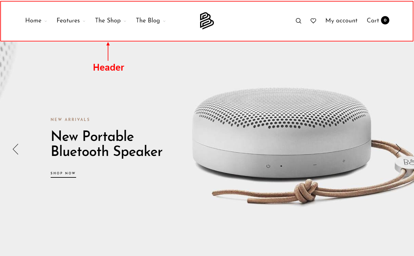
How does a Header look?
How to set up Header?
Overview
Headers are gathered from multiple blocks, each block is a component. The header is made from blocks to help you create many different header styles. Depending on your arrangement and preferences.
| Types of blocks | Description |
|---|---|
| _Column | This is an important block used to divide other components, can choose a percentage. _Column block is the parent block, it contains all the remaining blocks added after it. |
| Currency picker | Show icon currency. |
| Customer account | Show icon account. |
| Language picker | Show icon language. |
| Logo | Show Logo. |
| Main menu | Display the main menu of the store |
| Mini cart | Show shopping cart icon |
| Search box | Allow to display search box. |
| Spacing | Add a spacing,you can choose width for spacing. |
| Wishlist | Show icon wishlist. |
Because the header has a block structure, the placement will be dragged and dropped by the blocks.
Step by step
-
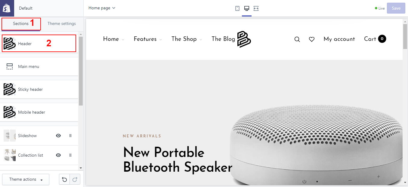
In your Customize Theme screen, under the Sections tab
-
Click Header
-
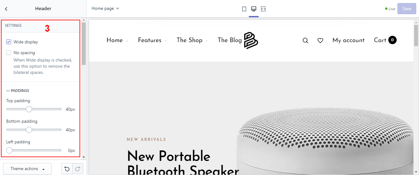
Overview settings
-
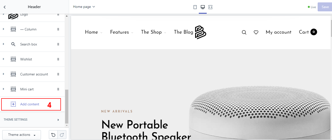
Add content for Header
Some important things, needed when you set up the header.
_Column block
Each column block is a parent block that can choose the width and contain all the remaining block types to be added later.
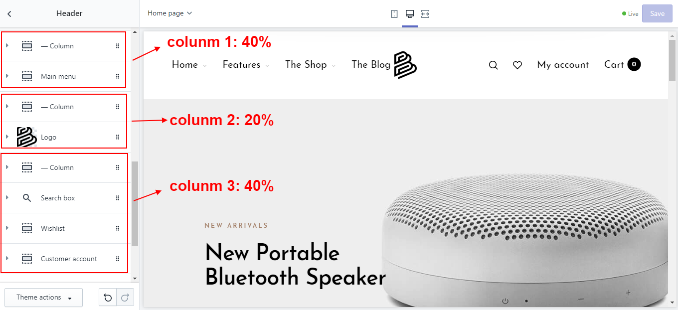

Column 1: The width is 40% and it contains the main menu block.
Column 2: The width is 20% and it contains the logo block.
Column 3: The width is 40% and it contains the Search icon, Customer account block, Wishlist block, Mini cart block.